Evolution / Progressive / Forward Thinking
Guidance in a Changing Future
With a name like “evolve”, you know the logo has to convey some sort of movement or change. As energy experts, E-Volve set out to advance the energy evolution, which really backed up the connotation in their name. Therefore, I knew I had to make this logo embody movement, change, and progress. I accomplished this by having every letter look as if it was formed by one gesture, which may or may not be finished forming. The rounded endpoints, lines that never intersect, and the orange dot guiding it all act to convey this idea.
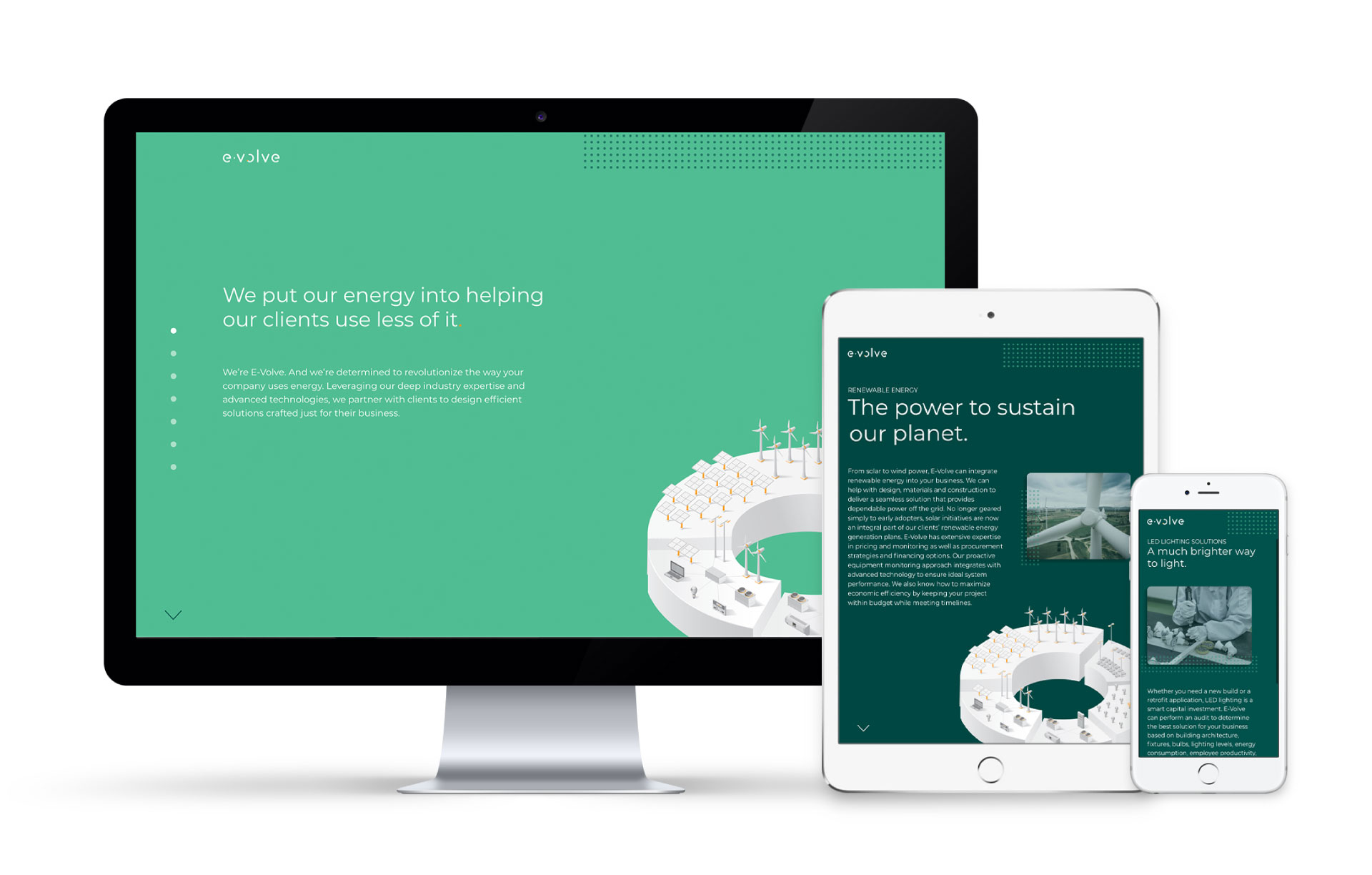
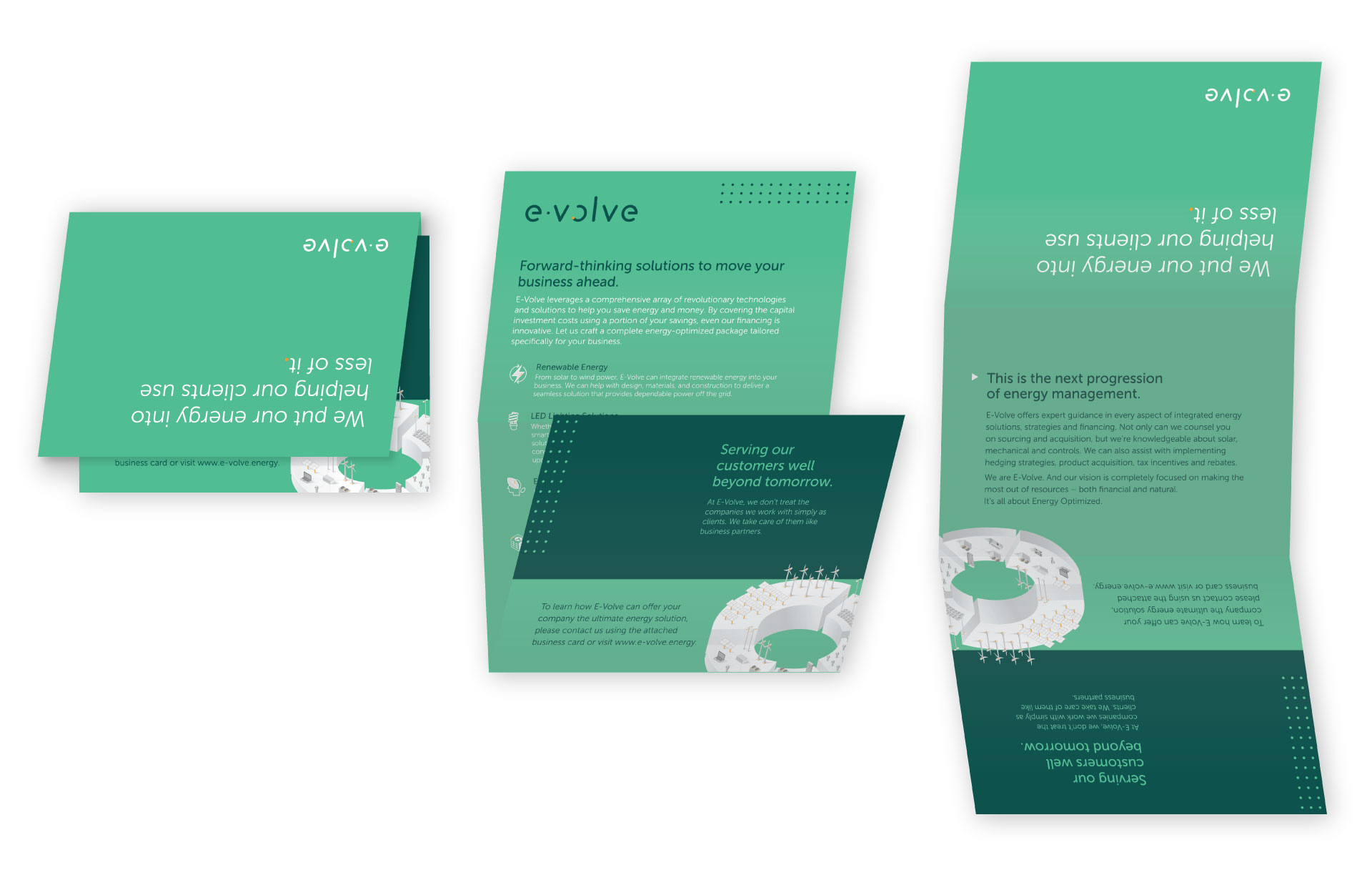
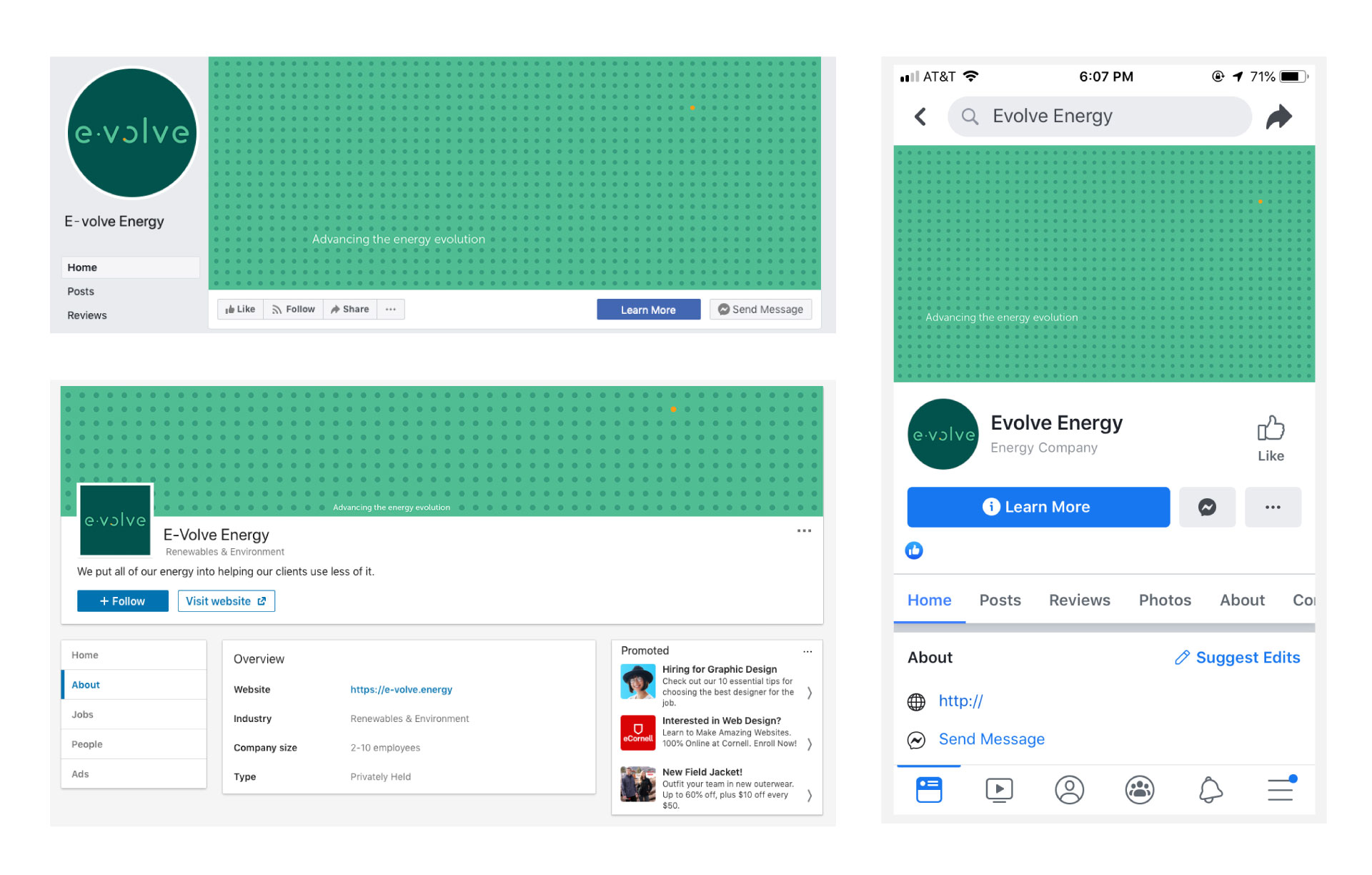
Green of course conveys energy, but this specific shade was intended to be a fresher take than you usually find in energy companies. Their competitors generally used darker, forest greens or blues. To set them apart even more and add real energy, I brought in an orange accent color.


